Feeds:
Posts
Comments

Archive for February, 2009

Bilingual Yoga @ LULULEMON

aaa2Como se llama? Join us for bilingual yoga on Sat. 9:30-10:30 am.

Saturday February 28th, 2009
Minneapolis Showroom 2313 W. 50th St. (50th & Penn)

Come and expand your practice and your language skills with Daniela from CorePower Yoga – Que Bueno!

an inspiraional photo by sevenstr8 one of my besties for life

Hello lululemon Lovers, and be sure to check out the kicken paint job painted by yours truly when your there!

Looking for free Friday night fun? Michelle Stutesman from Center Space Pilates will be offering a challenging pilates mat class and of course this will be complimentary for our guests. Join us from 6-7pm. Here is your weekly update on product. Click on the relevant link to learn more…

Read Full Post »

sherwins-colors

Here are just a few!  The DIY network has chosen these colors fromherwin’s 09 color series for the man cave they are building…but now you can see a few of them.

Read Full Post »

evolution

Well, I really have to tell you how impressed I was yesterday after attending the Sherwin Williams Color forecast conference at the IMS building.  I met Peg of Interiors of Stillwater after a busy day of working and running too many errands for any sane person.  We met in the large industrial style conference room over at IMS for wine, champagne, sparkling water, strawberries, cheese and crackers and of course…a beautiful color lecture.

I do have to admit I do tend to be a little biased when it comes to Sherwin Williams paint stores.  I rarely use them since the Hirshfields is closer to my home, is used primarily by all of my clients, and really seems to understand color trends and the design approach to colors and innovative technologies.

That being said…I’ve been much more involved with Sherwin Williams through a world of different mediums this past year.  And I got to say… they are without a doubt stepping up.  They have been behind on the trends for too many years now and are really starting to get involved with the design world, as well as decorative artists and I am so happy to be on board for the ride.

The forecast was wonderful.  Without further ado….here are the key notes and points of what spoke to me most at the conference:

Sherwin Williams chose the 2009 colors from the influence of 4 major categorizes, Global Tapestry, Techno Color, Local momentum and Conscious luxury.

Techno Color:  The automotive industry was involved in the inspiration for this section.  Typically a automotive company will wait 4, 5,  or 6 years before they introduce a new color.  They wait this long in an effort to bluedarkroomsee whats truly accepted and sticking in color trends, versus what may just be a fad. We were shown photos of futuristic looking suzikis with crimson hues and eco-friendly jeeps.  Another “trend” mentioned as pulled from these inspirational vehicles are HIGH GLOSS finishes in bold solid colors.

We were shown images of a car model made strictly by mimicking the aerodynamics of a type of oceanic fish in “auto industry meets biomimicry”.  We were shown a wild innovation known as phosphorescent paint in the  technological inspiration section as well as cell phone skins, and various sustainable and carbon footprint decreasing types of architectural buildings.   (This phosphorescent photo was pulled from http://www.archidose.org/Blog/bluedarkroom.jpg)

We were also shown images of chandeliers made from old car reflectors and an ottoman made entirely of old flip flops.  Needless to say Sherwin’s is all for the environment, but more on that later.

Next up was the inspiration from Conscious Luxury.  Costa Rica was first mentioned as a travel destination and as being a mecca for eco-friendly lodges and get aways.  There was mention of the Virgin Atlantic Airline and its involvement in decreasing airline and travelers carbon footprints with there offsetting program.

All natural Diamonds were brought up, as well as electric cars, bikes, The Tesla Roadster owned by the likes of Matt Damon and George Clooney.  The beauty of this is that the speaker mentioned people are making an effort to help the environment but they want everybody to know they are…and referenced those bags clearly labeled “this is not a plastic bag”.  I know you have seen one somewhere.

faar_ilist_linda_loudermilk_hEcoluxe designer Linda Laudermilk was mentioned for her organic looking soft tones and innovation making all her garmets from eco fibers. View http://www.wmagazine.com/fashion/2007/10/linda_loudermilk for more information.

Next up was the inspiration of Global Tapestry… this was the section that spoke to me the most.  Being the savvy traveler and the wild color lover  that I am I just burst with giddiness at the wondrous colors and there origins of influence including St. Petersburg Russia, Sao Paulo Brazil, Indonesia, and Jaipur India.  In each of these countries they spent a special amount of attention on the little things.  The great little details including an extravagant historical costume in Russia.  This is where they pulled the 09 Alex SW0060 color.  Street signs, restaurants, cuisine and other locations for tropical tones and whimsical shapes were all  pfirstsceneulled from eco-friendly businesses and home owners for color influence from Brazil.

Paper was a very large source of color inspiration in Jaipur, India.  We were shown lovely messes of ink from exotic paper manufacturers and reminded that sometimes the most lovely things can be pulled from what most preserve as a mess.  I believe the Plummy SW6558 color was pulled from the paper influence. As well as lovely dusty roses and violets, beautiful pink corals, all from paper pulps and such.

This Raj type inspiring tent is from http://www.aucklandzoo.co.nz/Homepage/Plan-Your-Visit/Venues/Outdoor-Venues/.

Lastly we learned of the Local Momentum category which included local farmers markets, building gardens, planted outdoor furniture, fruit maps, and buildings with exteriors which are gardens.  Yes, I did say Echo Fruit Maps… apparently there is a company in Los Angeles that sells maps of where all the Public Property Fruit trees are.  If I were homeless I would be there.

couch2.bp.blogspot.com/…/DRJPfPiImvw/s400/1.jpg

All in all, the forecast was wonderful, inspiring, and very very informative.  You can view more information about the Sherwin Williams 09 Color line or read up on what the company is doing to change the way we treat paint at: http://www.sherwin-williams.com/pro/paint_colors/paint_color_trends/2009/forecast-influences/index.jsp

Thank you Sherwin’s for such a lovely experience!

yours in color, LULU


Read Full Post »

I work with a lot of designers in my field.  Before I began building relationships with designers I heard tons of horror stories about designers relationships with painters.  Tales of mis-communication, furious tempers, colors off minutely and problems never fixed.  This did leave me partially worried when reaching out to designers, but being a firm believer in letting the universe know what your looking for, so it can provide for you…I did just this… and one of the gems that I got in my wishing well has been such a gift, that I feel obligated to share such a talented soul with all of you. erica-3

Her name is Erica Cooper, owner and designer for Your Style reDesigned.  I’ve had the pleasure of witnessing her vision first hand on many occasions.  She is spunky, artful, and delightful.  She has a keen eye for even the slightest of details, and calculates each and every more of her wonder rooms for her wide variety of clients and there homes.

*Erica, I have had the pleasure of working with you and have seen first hand the beauty and warmth that you create for your clients. But for those people out there who may not know about your Interior Design company Your Style ReDesigned, how can you best explain your services?*

I design spaces for real-life. Whether the homeowner needs a paint consultation, some window coverings, or a complete design plan- my services are designed to make life easier for my clients.  I believe in starting with functionality first and then creating great design around that, because it doesn’t matter how pretty a room is… if it doesn’t work with your day-to-day life. I believe in celebrating home, embracing the daily, and living creatively.

*So do you have a particular style or does it vary from client to client?*

It’s all about my client’s style. I always start with my client’s belongings to springboard the design process, so it’s never about me or what I like… I can’t have a “signature style” if it’s all about them! I take my client’s wishes and desires for their room and make them happen within their budget, style, and time frame.

*I know how absolutely sweet and easy going you are from working with you in the past. I’m wondering what other traits a client can expect after calling you to potentially use your services?*

It’s all about the details. Making sure that they understand the process and all of the elements involved. I want to make sure I understand my client’s needs, so I do a very detailed interview, including planning a budget for the project. I like to make sure even the small details are taken care of… such as washing the sheets when making the bed; designating a space for the kid’s backpacks when they come in the door; or wallpapering the front closet for a wonderful surprise when they put a guest’s coat away. Most of my work comes from referrals and repeat clients… once I have provided that personalized service, they keep coming back!

*I have been fortunate enough to get ideas and be inspired by the designers that I work with, I’m wondering what would be some of the other reasons that someone would use a Interior Designer? What are the benefits? and what type of costs can a client expect to pay?*

Most of my client’s testimonials tell me that they are thrilled to have someone else do the legwork, find the merchandise, use the space in ways they would have never thought of, and narrow down the unlimited choices for them. I believe it is a stress-reliever to have someone who takes care of the details for them. I don’t cut my own hair, diagnosis my own car problems, or repair my computer…. I hire professionals to do what they do best. So I offer the same service to my clients.

Costs can vary quite a bit when working with a designer, traditional interior designers can range from $95-300 per hour. My services are arranged in several layers to allow my clients to choose what services they do need. If they are looking for a DIY Consultation to get a project started, a single window covering, or a complete design project, I can accommodate their needs. My hourly rate is $85 per hour for most projects. Consultations start at $150 and Redesigns can start as low as $350.
erica-5

I have had the pleasure of working with you in Bloomington, Eden Prairie, and Minneapolis, where else can we find you designing away?*

I have worked in homes, offices, condos, and businesses all around the Twin City metropolitan area, throughout the greater state of MN, and across the U.S. I have even been privileged to travel to a client’s home in the Caribbean. I have also worked on several relocation projects where the homeowner is moving from one state to another.

What is the one thing that every home needs in your professional opinion?*

Personal items that bring us joy and remind us of special moments and people in our lives. Our homes are so much more than “stuff”, we need to be comforted, rejuvenated, and reminded of what really matters at the end of the day. I once read an article about a designer who said he never used family photos in a living room; he insisted that wasn’t the place for them. I couldn’t believe it! Why wouldn’t we use photos of our loved ones or special moments in our living spaces?

*When we were in Bloomington your clients chose the most unusual light fixture for there dining room, can you share with us a little about the piece and where it came from?*

The piece was a large chandelier that was covered in a form-fitting translucent paper and it resembled a large white seashell. When lit at night, it just glowed. It was brought with them from their home in Houston, TX. The homeowner had loved living in the Caribbean for many years and her home in Houston reflected that. Since she loved it, we incorporated it into her new home in Minnesota. It was her way of remembering where her heart was. erica-2

*What are some of the other unusual things that you have had to use in one of your designs and were they hard to design around?

I have used a variety of things that have belonged to the homeowner and have not necessarily been a design element, but needed to be incorporated into the design. If it’s important to them, then we do our best to include it. Sometimes, it surprises us all by making a really fun contribution to the design overall. I have used a variety of antiques, including crib slats or industrial pieces; I have designed with family heirlooms and unique pieces that one of the children has created. It always works out and makes a special statement for that family.

Whats next for Your Style ReDesigned?

I am always thinking. I have always have an idea…or ten…floating around waiting to come to fruition. I love making my client’s lives easier, so most of my services are needs I see need to be met in my client’s homes. I have expanded my Relocation Services by starting to market for them separately. I have had a huge response to my Turn-key Relocation Service that reduces the stress factor for my clients during that stressful moving time.

In response to keeping my clients updated on all things home… I have added a blog and send out my newsletter more frequently. I relocated my office to allow for even more space to take care of all the details and have expanded my team to make sure I that can make it all happen on a daily basis. I am currently creating a few new programs that I hope to have out and ready to go in the next couple of months. It is an exciting time!

and finally, what are four things that you just cannot live without?

Besides my husband, two teenagers and our dog…

1. Travel… it inspires me and lets me see the world with new eyes.

2. The written word… from a good novel, to a décor magazine, to my bible. I am never far without one of them… food for my soul.

3. My ultra comfy bed… layered with duvets and pillows… the perfect place to read or snooze, a comfort that I couldn’t do without.

4. My hot water on tap… along with really some dark chocolate… there is nothing a good cup of hot tea can’t fix!

Erica you are positively a gem to the design world.  Thanks so much for taking the time to interview with me, for all the fun projects, and more importantly for so very much inspiration!  I’m sure we will be seeing each other soon!


For more info on the very talented Erica Cooper, Please visit her at any of her following websites or blogs:

Your Style reDesigned, Inc
www.yourstyleredesigned.com
763-441-6950
erica@yourstyleredesigned.com

Read Full Post »

dsc02683 Steph is one of my most treasured clients.  The reasons for this are endless…her great sense of style, keen eye for color, willingness to look beyond a project and take it to a whole other level.  This is the client that when faced with a most ugly old metal heating and plumbing exposed pipe system in her front entry…smiled with excitement when I suggested we paint everything in a silver metallic in order to work beautifully with her clean white trim, slate floors, and organic tweed style wallpaper. Here you can see for yourself below on the right!

first-upload-083

If you were to walk through Stephs house you would notice little tastes of some of the most loved and valued colors out there in the world.  Some of my favorites being: Split Pea, Harbor Fog, Kendall Gray, and Atrium White all staples in the Industry and all demanding a certain type of client and pallet for display.

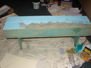
Recently Steph showed me an old bench she found at her parents house years ago.  Still with dirt worked into the cracks from being outside for one too many year.  The wood had split into cracks from too much moisture and water exposure, and there were cob webs nesting underneath the seat of it.

It was a faded….FADED green, and Steph had the perfect place for it, but it wasn’t the perfect look.  To my great delight she decided on Peacock Feather by Benjamin Moore as the color for the bench.  We then decided we would stencil the bench, to add a little more flavor, but simple tones as too not be too cutesy.

We choose a cream.. well actually she trusted me on this one… I chose a cream..picked up the bench, and brought it back to my studio to work on at my leisure.

First thing I did was sand it 100% with a fine sanding block.

I used Aura Paint which is self priming as the base, then taped off my focal stencil zoned using the Green Froggy Tape, available at any hardware store.dsc02742

I rolled two coats of the cream tone into the taped off areas and let dry over night.   I chose a stencil from Wallover Stencils (I used the Maya Rose one) because I just love there detailed designs, great for all over applications or simply on there own.

I sprayed glue adhesive to the back of the stencil and placed the design over the cream.  I then simply stenciled in with the Peacock Feather paint on all three sides of the bench.

Lastly, after removing the tape I put one coat of Safe and Seal over the whole thing for a little added protection.  What a simple and fun project it was.  I loved the bench so much, I really didn’t want to give it back.  It looked lovely with our chocolate couch.  I did the right thing though…  Now its back happily at home, with its loving mom…just past that room with the silver pipes, holding lamps, and looking lovely.

dsc02746

Thanks for the fun project!  LULU

Read Full Post »

marathoning

What I’m Reading

My lovely step sister that I will be running the Disney World Half Marathon in 2010 sent this book over for me in January.

Neither of us have ever run a half Marathon before.  GASP!  Nor are we seasoned runners.  I’m finally opening the pages of this wonder book.  I think its really going to help in breaking down the fears that are involved in finishing this race, and really show me how to make this a life change but more importantly have fun!

I’ll keep you posted on if my predictions are correct!

Happy Running Folks!

You can order yours at the website:

http://www.marathoningformortals.com/uof/marathoningformortals/

or.. maybe I’ll send you mine when I finish it!!!

Happy RUNNING!!!!  LULU

Read Full Post »

dsc02663dsc02669

Here are some of the first pictures that I remembered to take when we were first in Stillwater.

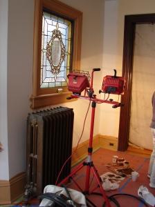
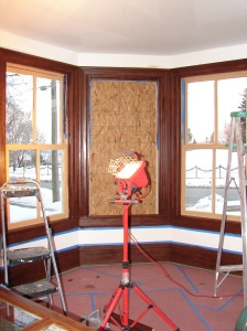
The project involved matching the exact stain that was in the house already.  It is a beautiful finish, on each and every floor, piece of trim, and door throughout the lovely home.  I had honestly never seen anything like it before.  The stain was obviously brushed on but involved some little brush squiggle’s for lack of a better term. These really created a lot of interest and depth into the trim work as well as some history of the home and its past occupants, very artsy!!!

The contractor was wonderful to work with on this one.   It was our first time working with him and he took care of every little detail and was really on top of his game.  Needless to say he made our lives a lot easier and the job much smoother which in this industry is absolutely one of the greatest blessings.  We got the windows completely bare bones, then we had to sand everything down, tact cloth it, fill holes, caulk etc.  then prime everything for the gel staining.

Anyone who knows me knows how much I love a good challenge.  Gel Staining at times can be a challenging project but mostly only in the beginning stages.  Once you get your groove, its not only satisfying, it’s FUN!   As is usually with gel staining, on this project the only real struggles we faced were with nailing down the exact same finish as was in the home and of coarse time.  Is there ever enough?

dsc02671

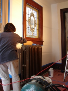
To the left you can see what the stain looked like once we were in the middle of applying it.  It was a very labor intensive project because of how many times you had to be going over the same spots.  But the results…well… the results speak for itself.  We got it perfect!  You can not even tell the difference between what was originally in the home and what was new.

The thing I love about gel staining is the versatility of the product.  I typically use Old World Gel stains that I purchase at Hirshfields.  Peg and I used a different product this time around that the contractor had picked up and it worked wonders as well.  I believe we ended up using a combination of Maple and Cedar, and then brushing over with a chip brush in walnut to make the “little squiggle’s”

Peg really put her heart and soul into this one.  I am so honored to be involved with the team that I am.  We really work wonderfully together.  Oh the places we shall go.

Here are the finished results!!!!

dsc02715

and again…

dsc02714

Happy Gel Staining!!!!!  LULU

Read Full Post »

dsc02713

This past week the team and I found ourselves all over the place.  One of the houses that we were working on was located in Stillwater and true to the Stillwater way was just bursting with character and personality.

We originally were exposed to this beautiful home and its wonderful family through a contractor who needed to have a particular type of gel staining done.  It needed to be done to the new windows for the front room to match the existing trim and windows that have been with this home since the beginning.  (I’ll post these next time)

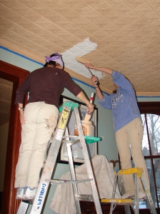
Well, in being there and working on the trim we got a chance to see some really beautiful ceiling tiles that were simply painted in white.  You can imagine our excitement just at seeing them alone.  Add to this our creative flair, and the three of us were just buzzing with all of the jolly things we were wishing to do to them.  In the end the homeowners chose a simple Modern Masters effect, using a whiz roller and lots of zig zagging that left the rooms nothing short of striking!

The first picture is of the girls priming the ceiling tiles over the white that was already on the ceilings.  dsc027201

This second picture to the far right shows how well the metallic paint was covering over the primer and the ceilings in process.  This picture does not quite show the dining room in the back, but there were larger tiles in there that received the same treatment.  What was very interesting about this process is that although we did the same method on each of the rooms the appearance is very different in each of the rooms.  The larger less detailed tiles really show the movement in our rolling, and a bit more definition in the color of the metallic paint, really highlighting the highs and lows.  The smaller tiles appear very clean and uniform, and they both look gorgeous!

We ended up doing a lot more projects for this wonderful family including a accent red wall in there teenage sons room, then painting the rest of the room in a butter-cream tinted beige.  We did all the new windows, and trim in the front sitting room, and some other projects as well.  The home was lovely to be involved in beautifying even more.

Below is the finished result in one of the rooms!  I’ll post pictures from the trim project soon!  Happy Painting!!!  LULU

dsc027331

Read Full Post »

I’m in Love…

shower-curtains

I can’t stop thinking about this pesky shower curtain… I spotted it months ago in an Anthropologie catalog.  Ever since its been dancing dizzily in my mind, begging me to buy it and sing to it each morning in the shower.

Its perfect!  Flirty, Boho, whimsical, fun… a burst of sunshine to get you going every morning.. oh yeah but wait.  It’s $118 buckaroos.  I just can’t justify spending so much on perfection just yet… but boy oh boy am I close.  For those of you who are ready to make the mega-amazing shower curtain of dreams a reality…you can purchase it here:

http://www.anthropologie.com/anthro/catalog/productdetail.jsp?id=893020

flamenco-shower-curtain_623f8eb0-ruffles-blue

Read Full Post »

I was featured in the January Newsletter for NTA and SALI.  K Rauworth from Paint to Pixels puts it together every month.  You can view her website at www.PAINTtoPIXELS.com.  Here is what K put together…  enjoy!  with valentines day love, LULU

alicia1 K Rau

Read Full Post »

Older Posts »